Gold’s Real Performance Over the Past Two Decades
Many factors should have pushed gold higher over the years. So, how has gold performed against the S&P 500?
The chart below features the HUI Index to S&P 500 Index ratio. In other words, it’s an approximate relative performance of gold stocks vs. all stocks.

First of all, the above chart emphasizes just how weak the precious metals sector has really been in the past decade and more.
For those, who think that the precious metals sector remained in the bull mode throughout the years, here comes the shocker:
Gold stocks’ performance since 1999 has been worse than the one of the S&P 500 Index.
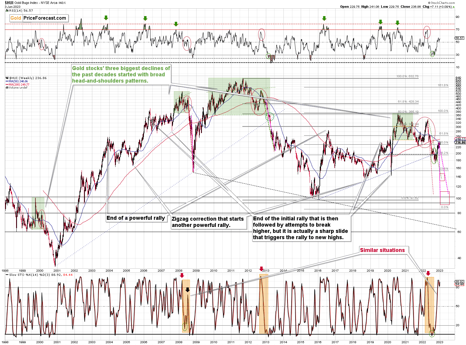
Gold hasn’t moved above its 2011 highs in a sustainable manner, even despite war in Europe, but the real weakness since 2011 is visible only after you look at how much gold stocks declined compared to the general stock market. The ratio is now just a little above 10% of what it used to be at the 2011 peak.
Interestingly, the corrective upswings in the ratio have been smaller and smaller. This is the fourth corrective upswing since the 2015 / 2016 bottom. Given the above, it seems that when the ratio finally breaks below the 0.05 level, it will slide profoundly once again. Even if the slide is not as huge as it was between 2013 and 2016, it could be big enough to cause serious pain in the precious metals sector – just as we saw in 2008.
There is a very strong support at the 2000 bottom – the all-time low of 0.026. A move there implies an over 50% cut in the prices of gold stocks, even if the stock market doesn’t decline.
With the S&P 500 at about 3,800, the above would imply a bottom below the 100 level.
And if the S&P 500 slides, then the bottom could take place even lower – perhaps at the 80 level.

As a reminder, 100 is the level that the HUI Index reached at its 2016 bottom. Consequently, the above implies a truly spectacular slide in the following months.
Thank you.
Przemyslaw K. Radomski, CFA
Founder, Editor-in-chief